Romance FC

A crest redesign rooted in community, culture, and eleven years of grassroots football.

A crest redesign rooted in community, culture, and eleven years of grassroots football.

A crest redesign rooted in community, culture, and eleven years of grassroots football.

ABOUT THE PROJECT

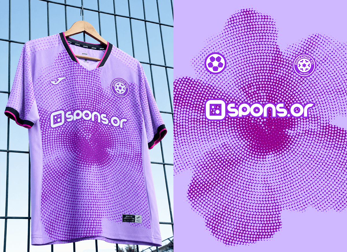
A rebrand for Romance FC, a London-based women’s football collective. We designed a new crest built around the club’s identity — its eleven-year history, multicultural community, and the idea of growth against the odds. Every element earned its place: the mark, the palette, the kit direction.

A rebrand for Romance FC, a London-based women’s football collective. We designed a new crest built around the club’s identity — its eleven-year history, multicultural community, and the idea of growth against the odds. Every element earned its place: the mark, the palette, the kit direction.

A rebrand for Romance FC, a London-based women’s football collective. We designed a new crest built around the club’s identity — its eleven-year history, multicultural community, and the idea of growth against the odds. Every element earned its place: the mark, the palette, the kit direction.

THE CONCEPT

Romance FC came with a clear direction: a water lily at the heart of the crest. Not arbitrary, water lilies grow from the sludge at the bottom of a lake and surface as something beautiful. For a grassroots women's collective building something real from nothing, the symbolism wrote itself. Purple for power. A football embedded in the bloom. Eleven years of the club encoded in the mark.